This page, provided by William Peterson, also appears on his
Modern
Fine Printing web site. I am grateful to him for making a copy
available to the library after he removed it from his site. Although
he has now restored it, I have, with his permission, retained this
copy.
Some Notes on
Liturgical Printing
By Daniel Berkeley Updike
This essay by Daniel Berkeley Updike, the founder of the
Merrymount Press and the author of Printing Types, was
published in The Dolphin, no. 2 (1935), 208-16, from which
it has been scanned. Updike's footnote symbols have been
converted into numbers within brackets, which are linked to the
notes at the end of the piece. (Please observe that it is
possible to return to the footnote number in the text by clicking
on the left-arrow button at the end of each note.) There are also
links to the illustrations
that accompanied the essay in The Dolphin. --
W.S.P.]
* * *
The word "liturgy," from which comes
the word "liturgical," is derived from the Greek leitourgia,
signifying public worship, but in English its primitive meaning
was the service of the Holy Eucharist, sometimes called the
Divine Liturgy, because it is a service instituted by Christ
Himself. There was, too, a secondary meaning, which has now
obscured the original idea; it signified the set formularies for
the conduct of divine service in the Christian Church.
Liturgiology is the science, if it may so be called, which
pertains to liturgies, their construction, peculiarities, forms,
and use; and liturgical printing is that branch of typography
which has to do with the arrangement and printing of such forms.
To understand liturgical printing as it is now
practiced, we must know something of its typographic history, for
it has retained the marks of that history to the present day. The
first liturgical books were, of course, manuscripts, and although
in the earliest of these there appear to have been scanty
directions for the performance of divine service, when fuller
directions came into use the writers had in some fashion to
differentiate the words to be said or sung from the accompanying
directions as to where, when, and how to say or sing them. The
easiest way to show this was to write the words to be said in one
color and the directions in another, the latter sometimes in a
smaller letter as well. The words to be said, being of major
importance, were written in black, and red was adopted for the
directions. These directions, being rubricated, were by a
transference of meaning called "rubrics. " Apparently
the word "rubrics" first appeared as applied to a
liturgical book in a Roman breviary printed at Venice in
1550; but it occurs in manuscripts of the fourteenth and
fifteenth centuries. "Lege rubrum, si vis intelligere
nigrum," says the adage: "Read the red, if you wish
to understand the black."
Indeed, rubrical directions exist in the
Bible--for instance, in the Psalms the word Selah, which
appears to be some sort of musical direction, meaning, probably,
an interlude. Whether any difference was made in the characters
used for Selah in Hebrew manuscripts, I do not know, but
it is a fact that the differentiation in the use of type in
liturgical printing was not confined to Christian liturgies. In
Hebrew modern books of devotion one finds the same thing.
Rubrical directions are indicated by the insertion of a Hebrew
character in outline, or by the use of a small size of the normal
Hebrew character. Furthermore, the important sentences or words
in the service are indicated by very large type, precisely as in
Roman Catholic missals, or by setting certain words in capitals,
as in the American Book of Common Prayer.
The earliest Greek Orthodox liturgical book
printed in Russia was Chasovnik, a book of hours, issued
at Moscow in 1565--the second earliest dated volume printed in
Russia, the first being an edition of The Acts of the Apostles
printed in 1564. These books were printed in the Cyrillic
character, a letter derived from late Greek capital letters.
Liturgical books of the Greek Orthodox Church appeared prior to
that date outside of Muscovy, the earliest ones having been
printed at the end of the fifteenth century in Poland--at Cracow
in 1491. These, too, were printed in "Church Slavonic,"
using the Cyrillic character. [3]
Two modern books printed at Moscow are good
examples of comparatively recent Greek liturgical printing, for
under the Soviet regime such books are no longer produced. The
first book mentioned is a service book (Sluzhebnik) of
1894, and the second (Trebnik), of 1906, is of the same
nature. Both the Sluzhebnik and the Trebnik came
from the press of the Synod Printing Office (Sinodalnaya
Tipografia) of Moscow. These books are printed in red and
black, and an illustration of a page in the Sluzhebnik volume
is reproduced. Before the Revolution, the Synod Printing Offices
of Moscow and of St. Petersburg were the chief printers of Greek
Orthodox liturgies and of devotional works generally. Although
the Moscow establishment came under the jurisdiction of the Most
Holy Synod only in 1721, its history goes back to 1563; as for
the St. Petersburg Printing Office, it was active for over two
centuries prior to the Revolution, with some intervals.
As far as I have been able to examine the
eighteenth-century books used in the services of the Orthodox
Church, they are roughly put together and are not very good
pieces of typography. But the rubrication in all these books,
whether old or new, appears to be governed by the usual rule that
words to be said are printed in black, and directions for their
use in red, as in Roman Catholic and Anglican rubricated prayer
books. When only black is employed, the rubrics are printed in a
smaller size of type.
These Greek Orthodox service books are so
unfamiliar to most English-speaking people that they have little
practical value for the reader, except as showing the
universality of certain methods of printing liturgical books. [4]
For liturgical printing, as English-speaking
people know it, we have two sources--Roman Catholic liturgical
books and the liturgies in use in the Anglican Communion. These
differ in some particulars.
The printing of the authorized Roman Catholic
books is chiefly in the hands of three publishing houses,
Descl�e & Cie of Tournai (otherwise known as the Soci�t�
de St. Jean l'�vang�liste), Pustet of Ratisbon, and the Vatican
Press, at Rome, about each of which something should be said.
The brothers Henri and Jules Descl�e, who had
already built a monastery on their property at Maredsons,
Province of Namur, Belgium, founded a printing press in 1882 at
Tournai, and under the name Soci�t� de St. Jean l'�vang�liste
published a series of admirable liturgical works, arranged
according to the best liturgical traditions, harmoniously
decorated, and technically excellent. They had a part in the
musical printing required in the movement for the reestablishment
of the liturgical chant, inaugurated largely through the
influence of the Benedictines of Solesmes. Their editions served
as the basis of the Vatican edition ordered for universal use by
Pius X.
In the Descl�es' books the principle that the
directions are to be printed in red and all else in black is
consistently followed, and headings such as "Introit,"
"Gradual," "Epistle," or "Gospel,"
are rubricated, as these are in a sense directions Moreover,
references to passages in the Old and New Testaments are
rubricated, for they are merely guides to the verses quoted and
would not be said. For the same reason, apparently, the running
headlines describing the contents of the page below appear in
red, for they, too, are directions as to the day, hour, or
occasion of the service. But for purpose of convenience the
headings of each new section on the page are printed in bold
black capitals--which, while not absolutely consistent, is
convenient for purpose of speedy reference. In these books the
"Amen" to prayers is treated as a response--as it
actually is--and is preceded by in red in rubricated
editions, and the words of all versicles--short sentences said by
the officiant--are preceded by . In the matter of initials
there appears to be no fixed rule, and prayers begin with
rubricated initials or black initials, as taste directs. I think
this is a mistake. Strictly speaking, prayers should have
initials in black, for these initials are part of a word to be
said, and, moreover, black initials have a better typographical
effect. Rubrics in these books have initials in black, which I
think also open to exception, for rubrics, except in rare
instances, require no initials; but if used, such initials should
be rubricated also. A more serious fault is the introduction of
gothic initials in prayers printed in roman type. As a whole,
however, these books are consistent and careful pieces of
typography.
The Pustet family was of Bavarian origin. In
the first quarter of the last century Friedrich Pustet, who had
been a bookseller, started a printing house at Passau which four
years later, in 1826, he transferred to its present location at
Ratisbon. Enlarging the establishment and adding a paper mill to
the plant, the firm began to print and issue liturgical books in
1845, and later added facilities for the printing of church
music. In 1870 the Pustet house was given the style of Typographus
S. R. Congregationis, and the Vatican authorities have placed
in its hands the editio typica of all liturgical work. The
best books issued by Pustet are excellent, but their product is
uneven and they have been less fortunate in their decorations
than the Descl�es, whose books show a greater uniform
excellence. A disagreeable feature is the use of colored
lithographic frontispieces and pictures, and a later series of
these, intended to be more modern in feeling than those they
supersede, are no improvement on them. "In the latest Pustet
Missal," writes a correspondent learned in these matters, [5] "the
incipit letter of the text itself is often in color,
usually red. Another characteristic is the introduction into the
Canon of certain parts of the varying Communicantes and Hancigitur
prayers, to obviate turning the page at that important moment of
the service. In general, this new Pustet Missal pays attention to
the pagination of the prayers."
The Vatican Press (Tipografia Vaticana),
founded by Pope Sixtus V in 1587, was housed in the palace in the
building known as the Cortile della Stamperia and an
interesting "specimen" of its types and characters for
musical notation--Indice de Caratteri, . . . esistenti nella
Stampa Vaticana, & Camerale--was published in 1628.
Shortly afterward, the Congregation of the Propaganda established
a separate printing office for the needs of missions, in which
connection it issued, during the seventeenth century, a series of
grammar-specimens of its various exotic alphabets, the first of
which, Alphabetum Ibericum, appeared in 1629. This press
later developed into the Tipografia Polyglotta. In 1910,
Pope Pius X effected an amalgamation of the two, under the name Tipografia
Polyglotta Vaticana, and arranged a modern and finely
equipped plant. The new office prints the usual output of the
Curia, especially the Acta Apostolicae Sedis, as well as
the special choral editions of the liturgical chant, and the
typical editions of the missal, breviary, ritual, and other
service books.
The Vatican editions of plain song printed in
one color, italic being used for the rubrics, are practical,
workmanlike, and handsome; they are well adapted for what they
are meant for. "The typical editions of the Vatican Press
have the custom of printing the top of the page in red for the
title--for example, Praefatio solemnis in festo Sancti Josephi,
but using black for this same title as a heading for the actual
preface itself. Furthermore, in the actual directions, when a
text is referred to by name, the text itself is printed in black.
For example, 'Dicto Pater Noster et Credo,' the
underlined words are in black, the others in red"--precisely
the use in rubricated English prayer books. To persons wishing to
consult authoritative Roman Catholic liturgical books, the
Descl�es' publications will serve the purpose best. The books to
be looked at are the Missal, Breviary (in four
volumes for the four seasons), Rituale, and Officium
Majoris Hebdomadae (Offices for Holy Week).
For Anglican prayer books the three authorized
houses are the University Press, Oxford, the University Press,
Cambridge, and the King's Printers. These have in the Anglican
Communion much the same authority as the publications of Tournai,
Ratisbon, and Rome in the Roman Catholic Church.
The Cambridge University Press, now four
hundred years old, has printed Bibles and prayer books since
early in the seventeenth century. Baskerville produced for this
press, in the eighteenth century, some prayer books, more
remarkable because he printed them than for any merit of their
own. Creditable as are the Cambridge books and those issued by
the King's Printers, Messrs. Eyre & Spottiswoode, I should
recommend the consultation of the Oxford prayer books to students
of English liturgical printing.
The Anglican use in printing these official
prayer books differs from the Roman use only in minor details,
the chief of which is its employment of italic for responses,
eliminating the use of before each response. Italic even in
rubricated editions of a prayer book has in Anglican books come
to signify something not readily signified otherwise, i.e., a
response, as, for instance, the responses to the suffrages in the
Litany, and to the versicles in Matins and Evensong, and
"Amen" when said by the people. For the printing of
Protestant orders of service this use of italic is desirable, for
to the average congregation the and would be unknown,
but when a response is printed in italic the mark should be
omitted. The rule that italic should never be rubricated still
holds. In both Roman and Anglican uses, notes indicating
references to the Bible which are not said are rubricated.
In the folio Oxford prayer books the Collect, Epistle, and Gospel
are printed in full measure and, as far as may be, on facing
pages, enabling the book to be carried, open, from the
"Epistle" to the "Gospel" side of the altar.
The quarto prayer books are printed in the traditional double
column, which in liturgical books saves space and avoids ragged
pages. Both editions are printed from the celebrated types given
to the University by Bishop Fell, and are duly rubricated, but
are disfigured by the introduction of a ponderous series of
seventeenth-century Dutch "bloomers," as that kind of
initial letter is called, mixed with free initials, both kinds
being rubricated. A better piece of printing is the octavo
Coronation prayer book, [8]
also from Fell types, issued in 1902--though a bad
fault is the rubrication of italic in the catechism. There are
also a number of liturgical books issued by Anglican convents,
private societies, or persons, which, while having no authority,
are interesting pieces of typography.
A wise lady of my acquaintance once remarked
that although moral laws were clear, simple, and explicit, the
cases to which they could be applied in their entirety were few;
and she added that this was because the circumstances or
situations to which they were applicable were in themselves often
confused and complex. I am reminded of this dictum in connection
with our subject, for while it seems simple to say that all
directions in a liturgy should be rubricated and all else printed
in black, along with the understanding of a difference between
liturgy and rubrics there must be some knowledge of the
particular liturgy in question, as it is used. This
knowledge demands some further acquaintance with the theological
views implied or expressed therein, and I doubt whether a printer
unfamiliar with the ritual of the historic communions could
acceptably print services for them. Certain theological views
lead to certain acts; and these acts have to be expressed by
certain words used in certain ways, and these words and ways have
to be fostered, or at least not impeded, by the typography that
presents them. Nor are rules for rubrication, etc., simple from
another point of view: they cannot always be pushed to an
absolutely logical conclusion without doing violence to the
appearance and convenience of the book when in use. So while such
systems are of very general application, there are
"exceptional exceptions," and one must know when these
are allowable. The following axioms may be of practical use to
persons to whose lot it falls to prepare for printing, or to
print, liturgical work.
Concerning Type
Roman initial letters, either free or
block, should be used with prayers set in roman; and
gothic initials if prayers are set in blackletter.
Rubrics at the beginning of an office or
service do not require initials, the initial occurring in
the first prayer following the rubric. But, if used, the
initials should be printed in red.
Paragraph marks before rubrics may be
printed either in red or black, but when a number of
rubrics follow each other, black paragraph marks separate
them from one another more clearly. In some Roman
Catholic books a black arabic figure is substituted for
the paragraph mark, but then only when a considerable
number of rubrics follow each other.
When it is intended to indicate a versicle
and its response, and marks should be used in
either red or black. But in Protestant services, as these
marks are unfamiliar, the words Minister, People,
etc., may be employed, printed in italic.
Italic, being a substitute for
rubrication, should never be rubricated.
"Amen" when said by the people
should be printed in italic in a service printed in one
color, but when said by the clergy only should be printed
in roman. Note that in Roman Catholic services the
"Amen" is preceded by in red or black
when said by the people.
A Maltese cross X is a sign of
blessing and should never be used except to denote that
the sign of the cross is to be made. Almost the only
exception is its use in the singing of the Passion in
Holy Week, when it indicates the words of our Lord; or
before the printed signature of a bishop.
Prayers, psalms, hymns, etc., must be set
throughout in the same size of type and with the same
leading; and rubrics must follow this rule and be uniform
throughout the work.
While blackletter may be used for titles
or display lines on title-pages, or for running titles,
it should never be used for prayers in a liturgy to be
publicly used.
The use of colored inks to indicate
liturgical seasons (i.e., violet for Lent) is always to
be avoided.
Concerning Arrangement
A rubric should be on the same page with
the prayer, etc., to which it refers, and should be
closer to the text following than to the matter preceding
it.
The breaks caused by the turning of a leaf
should occur, if possible, at the end of prayers that are
followed by anthems or hymns.
"Turnovers" should be avoided
during prayers, psalms, or lections. But turnovers during
music are less objectionable than during portions of the
service which are said or intoned.
A versicle should never have its response
appear on another page.
In Anglican services the canon and the
prayers following should always appear on pages facing
each other, unless the Roman use is followed of a facing
representation of the crucifixion.
The traditional form of service books was
in double column, probably adopted by calligraphers to
save space, and to avoid blanks by short lines on a wide
page. For books of private devotion this is allowable. In
books for public use, however, a full-page measure is
preferable, since it is easier to follow. In the Roman
Catholic missal, the canon is probably for this reason
sometimes printed full measure, though the remainder of
the service is set in double column. This also applies to
the arrangement of plain song, which must be set in full
measure for the same reason.
* * *
Here these notes on liturgical printing end. So
little of a practical nature has been written in English on the
subject that they may be a slight contribution to a codification
of the rules applying to it. In an age when there seem to be more
questions than answers, it may be asked what need there is of
such minute rules at all. But in this instance there is an
answer. It was made by St. Paul when he said to the Church at
Corinth, "Let all things be done decently and in
order."
NOTES
[Please observe that it is possible to return to the footnote
number in the text by clicking on the left-arrow button at the
end of each note.]
 in red in rubricated
editions, and the words of all versicles--short sentences said by
the officiant--are preceded by
in red in rubricated
editions, and the words of all versicles--short sentences said by
the officiant--are preceded by  . In the matter of initials
there appears to be no fixed rule, and prayers begin with
rubricated initials or black initials, as taste directs. I think
this is a mistake. Strictly speaking, prayers should have
initials in black, for these initials are part of a word to be
said, and, moreover, black initials have a better typographical
effect. Rubrics in these books have initials in black, which I
think also open to exception, for rubrics, except in rare
instances, require no initials; but if used, such initials should
be rubricated also. A more serious fault is the introduction of
gothic initials in prayers printed in roman type. As a whole,
however, these books are consistent and careful pieces of
typography.
. In the matter of initials
there appears to be no fixed rule, and prayers begin with
rubricated initials or black initials, as taste directs. I think
this is a mistake. Strictly speaking, prayers should have
initials in black, for these initials are part of a word to be
said, and, moreover, black initials have a better typographical
effect. Rubrics in these books have initials in black, which I
think also open to exception, for rubrics, except in rare
instances, require no initials; but if used, such initials should
be rubricated also. A more serious fault is the introduction of
gothic initials in prayers printed in roman type. As a whole,
however, these books are consistent and careful pieces of
typography. 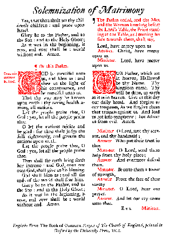 The chief of these three houses is the Oxford
University Press,
The chief of these three houses is the Oxford
University Press,